
Last week we described how to use storyboards to increase the use of visualization in proposals. Lack of planning is one reason proposals teams include too few graphics; cost is often another. But visualization doesn’t require high-end graphics. In fact, very large proposals often include simple visualizations created with MS Office programs.
The rest of this month’s posts explain how to create budget-friendly visualization.
Why and how to visualize
Using graphics as mere decoration is a waste of space. Instead use them to:
- Make important information easier to understand: Use tables and meatball charts to provide a snapshot of your team’s credentials, the range of services you provide, or relevant experience or performance. Use graphs to show trends, such as an improving on-time delivery record. Use flowcharts and illustrations to show key features of your solution.
- Make key messages more memorable: Draw the evaluator’s attention to one of your differentiators by pairing it with a graphic or photo. In fact, the main reason we include photos in a proposal is to make key messages stand out. See Figure 1. for an example of using a photo to add impact to a message.
|
 Figure 1: Add punch with a photo: Add eye appeal to an important message by pairing it with a photo.
Low- or no-cost graphics
Assuming you are using MS Word or Publisher as your proposal platform, here’s how to create or acquire commonly used graphics:
- Tables: Create these in Word, using a sans serif font in a slightly smaller type size than your proposal body copy. Format your paragraph spacing to 3 points above and below and use single line spacing. Set your borders to half point and shade every other line 12.5% gray. Use a strong colour for the header row and set the header text to bold white.
- Meatball Charts: Use an Excel worksheet, add colour, save as PDF and crop to insert as a graphic. We’ll describe meatball charts more fully in a further post.
- Graphs: Use Excel’s charting feature and create simple bar or doughnut charts. In the case of doughnuts, we like to select and right-click the doughnut graphic, select Format Data Series (see Figure 2) and add a 1-point white line. Copy the doughnut and paste it into PowerPoint for labelling, then print as a PDF and crop to insert in your proposals
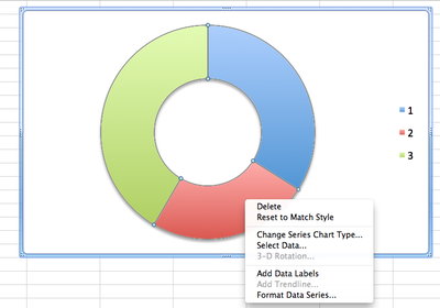 |
Figure 2: Easy doughnut charts: Select the doughnut inside the frame, go to format data series and format the image, then copy and paste the doughnut into PowerPoint to add labels. |
- Flowcharts: Use PowerPoint, save as PDF and crop. See next month’s post on creating flowcharts.
- Illustrations: These are more ambitious but you can use clipart plus imagination. To make your illustration look professional, choose clipart components created in the same style and colour palette.
- Photos: Since the goal is to attract attention to the caption, choose photos with visual appeal, rather than opting for prosaic alternatives, just because they show your equipment or people. To quickly find free photos large enough to use in print, use Google Advanced Image Search and filter for your topic, image size larger than 1024 x 768, and usage type = free to use, even commercially.
Visualization works
Complex2Clear works on high-stakes proposals, including some vying for multi-billion dollar contracts. Invariably, graphics content rises with contract value. Successful teams running very large proposal efforts typically aim for 50% graphics content, even when working within strict page limits.
If the biggest and best agree visualization improves their chance to win, why not use it?

